


I recently visited Santorini and was taken with these incredibly striking plants. Looking at the photos later, the colors reminded me of a boy’s bedroom we designed on the Upper East Side. In both cases, the red-orange adds an exuberant contrast to the saturated blues. I began to think about how color palettes that work in nature often translate seamlessly into interiors.

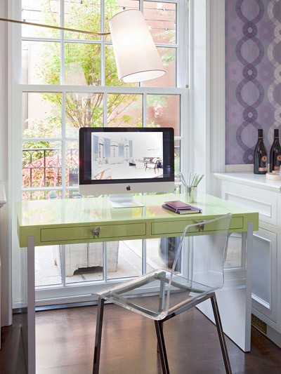
The color combinations we find in nature that make us feel happy can produce the same feelings when used in our homes. For example, lively purples and greens are a fresh and cheerful pairing. Here you can see that they are equally suited to springtime bouquets found in the flower district as they are to a colorful desk and wallpaper pairing in an exuberant kitchen.
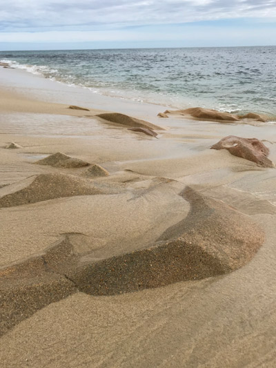

Spending time at the beach is magical. It can wash away our stress and induce a sense of calm. The feeling of soft tan sand under our bodies is soothing and liberating. The cool blue-grey water is refreshing and clean. Borrowing these elements from nature, we recreated the feeling we experienced at the beach in this NYC master bathroom. The calm color palette evokes the peacefulness of the beach. The organic shape of the tub echoes forms found in nature and the texture of the floor tile is reminiscent of sand.
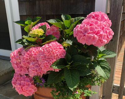

Bright pinks are grounded by green in this garden pot. For a project on Park Avenue, our client’s daughters wanted pink, pink, and pink! We suggested adding green accent pillows and accessories for a fun contrast.


In some cases, inspiration for a color palette comes directly from the project’s location. At this Quogue beach house, we used warm neutral shades to evoke the tones of the sand. Layered neutrals are always soothing, but this palette is especially suited to its setting.
Remember to always keep your eyes open! Inspiration is all around us.