

I love color in all its forms. Whether bright and bold, deep and moody, or soft and subtle, all hues have so much potential. Choosing the color palette that feels right to you is super important, because it transforms how we feel and experience a room. Although subtle, a neutral palette can be surprisingly powerful. It can make a space feel calm, inviting, and luxurious. It can transport us from our hectic lives into a space that is tranquil and harmonious. However, if not executed correctly, a neutral palette can appear boring and uninteresting. In order for it to be successful, it needs to show depth and dimension in color. In addition, it should include variation in texture, combining fabrics like velvet, mohair, linen, and silk.
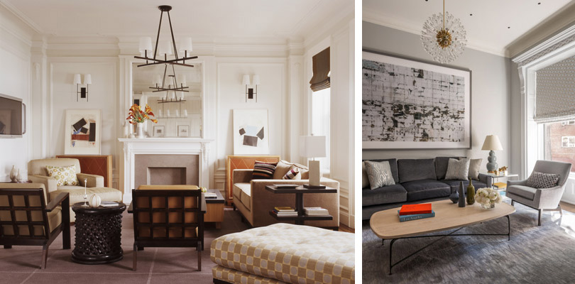
Colors have warm and cool tones. Warm colors lean yellow and orange, like a sunset, and cool colors tend to have blue in them, reminiscent of an overcast day. This applies not only to vibrant tones, but also to neutrals. See the contrast between two neutral interiors above, with a warm palette on the left and a cool one on the right.
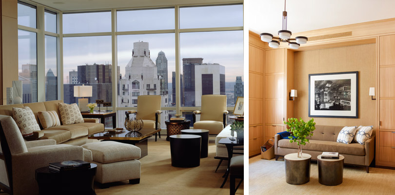
Warm neutrals are shades like tan, beige and brown. They tend to make a space feel cozier. In the Upper East Side living room above, varied cream and beige textures add depth while remaining tonal. In an Upper West Side office, a brown sofa complements the elm cabinetry.
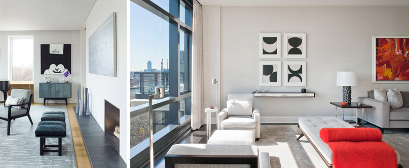
Cool neutrals are greys and taupes. They recede, making a room feel spacious. They are calming colors, perfect for this sophisticated Upper East Side living room. Cool tones tend to feel particularly elegant and fresh, as in this East End Avenue apartment.
Which do you prefer, cool grays, crisp whites, or warm beiges?