
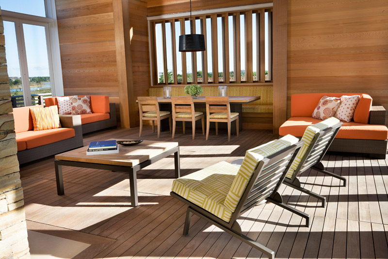
As you may know, we love color. (If you’re behind on our color series– check out our posts on purple, green, and blue!) This time, we’re diving into orange. Although it may not seem as easy to use, this punchy color works beautifully inside or out, and in the city or country. In this Quogue beach house, we chose green and orange fabrics for cheerful outdoor living. The combination reminds me of an orange tree!

Orange can be super impactful– it really pops against neutrals. In this East End Avenue apartment, a monochromatic palette is enlivened with vibrant orange art and accessories. Accessories are a great way to experiment with color without committing to bright color on the furniture.
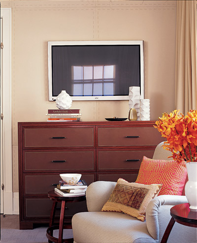
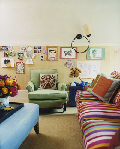
However, don’t be afraid to pair orange with other strong colors! The images above show two different approaches. The master bedroom (above left) has a cozy palette of warm beiges, reds and oranges. The kid’s playroom (above right) is a joyful explosion of a whole range of colors. Simple shapes, neutral walls, and a simple carpet ground the space.

Orange doesn’t always have to be bold. In this study, we specified a muted orange to complement the oak cabinetry. It feels sophisticated and calm, perfect for productivity. I hope these projects from our portfolio have shown that you the versatility of orange– it’s a great addition to the home!